
I made a BIG mistake on my latest mural.
You know that feeling when your gut tells you one thing, but you go and do the complete opposite? Yep, that was me on my recent mural project.
I was working on a bright, tropical mural where the client wanted a soft blush pink background to match the below Lust Home wallpaper.

LUST HOME - Jungle is Massive Wallpaper in sweet pink as a colour reference
Now, normally I’d head straight to Dulux for colour matching - no questions asked. However, since my local Dulux Decorator Centre was closed on Sundays (and I was being impatient), I visited B&Q and purchased a cheaper colour-match branded paint instead. Big mistake. Huge!
The moment I put it on the wall, I knew it was wrong. It was basically pink water—so thin and lacking in pigment, it practically evaporated on contact.


When I tried to blend the new paint, it clumped, dragged, and left behind a rough, uneven texture. It didn’t blend - it congealed. I wiped it straight off and had no choice but to wait until Monday to buy the Dulux paint I should have purchased in the first place.
Honestly, I don’t know why I didn’t just wait a day, but hey - lesson learned. This is exactly why I always tell my clients it’s worth paying a little extra for quality paint. With this brand of paint, I’d have been looking at 3–4 coats (and still a poor finish). With Dulux? One, maybe two, done.
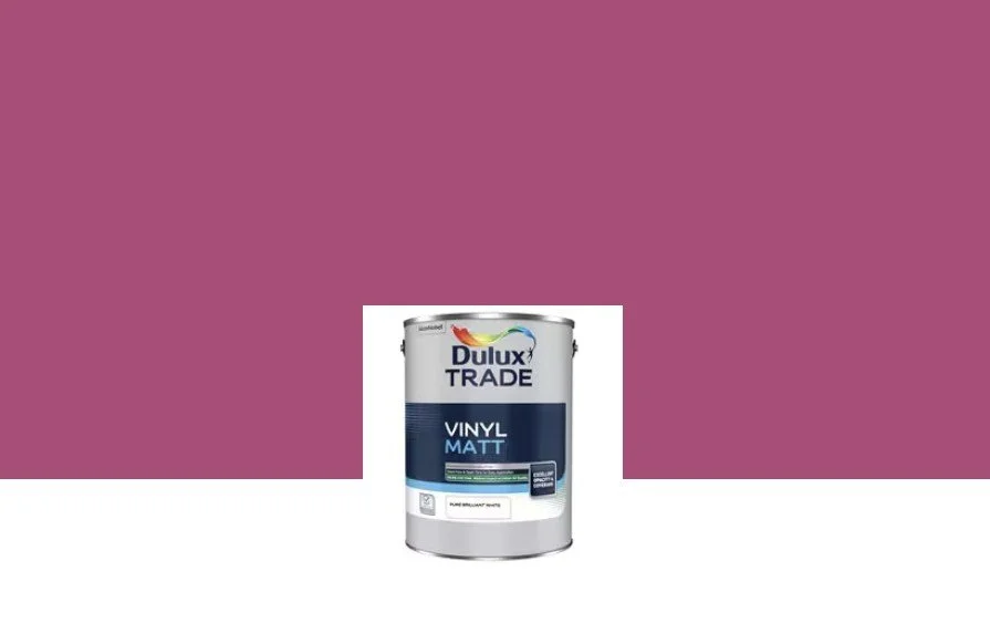
What I should have purchased!
So yes - buy cheap, buy twice. I learned the hard way, so you don’t have to. No, I'm not being sponsored by Dulux (but happy to have that chat if you like!) This is just me, being real about my mistakes as a mural artist!
Hope this helps others!
Kate & Norman